
Over the past weekend, if you logged on to the website for SAG-AFTRA — the labor union representing many stand-ins who work in TV and film — you may have noticed that the website had been redesigned.
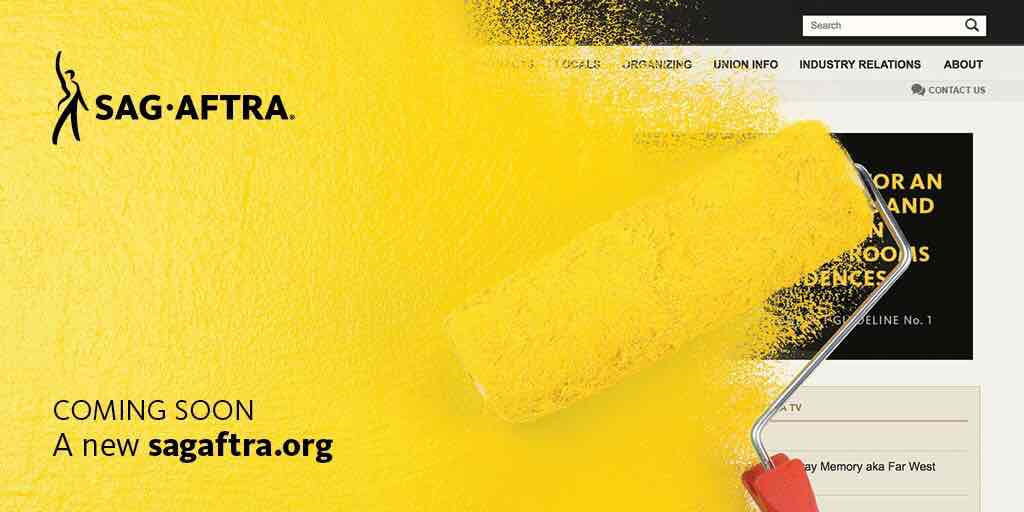
The familiar dark theme of the SAG-AFTRA website was replaced by a brighter, more responsive theme.
However, with the redesign, it seemed there were still issues to address — and which the union is presumably continuing to address as of this post’s publication.
Missing Content
Some content — like rate sheets — was missing or hard to find.
For example, when clicking on Contracts & Industry Resources in the main menu, then clicking on Television in its submenu, the Television Contracts page opens up. However, clicking on the tab for Rate Sheets & Digests simply reveals blank content. But when you click on Television from the sidebar menu, the tab for Rate Sheets & Digests has the rate sheets. This issue seems to be related to the Television contracts’ URL being coded in the main menu as contract “807” and in the sidebar menu as contract “810.”
Other content is plainly missing, and it’s not clear if it will be discarded or restored. For example, the union’s page about fi-core — titled “Get the Facts about Fi-Core” which existed in a similar form on the SAG website for a number of years — is gone except for this cached version on Google. (If you are interested in reading about financial core status, please visit our sister site Fi-Core Central to download The Fi-Core Workbook.)
Design Challenges
When sites are redesigned, it’s not uncommon for visitors to be a little confused. The redesigned SAG-AFTRA website left me really confused, but I’m starting to better understand it after a few visits.
Design-wise, the redesigned site is much wider and more spread out than the prior design.
My first reaction to this wider design was that I could not take it in without scrolling. On mobile, the wide design was even more problematic. I noticed the new design on my smartphone over the Father’s Day weekend, and the union’s website had an opening image wishing a Happy Father’s Day. Was this a labor union website or some kind of lifestyle magazine I landed on?
My biggest takeaway was that the new wider website looked like “spaghetti on a wall” — that is, a whole lot of whitespace, and pieces of information spread out all over the place. As I’ve digested the new website, I’m starting to take it in better. However, one drawback of this design is that the union news is not as visible to me, and that is important information I want to see immediately.
There were also some kinks to iron out in the new design. For example, on the page for the SAG-AFTRA NY Local, under “Explore the Neighborhood,” there is text in a narrow column that overlaps an image. I expect those types of kinks will get worked out over time. Obviously, redesigning this large site with a lot of old content on it was a large task, and small design problems will crop up when the site is live. No fault there.
Stand-In Central & The SAG-AFTRA Website
Because of missing content and design challenges, links to the SAG-AFTRA website that appear on Stand-In Central may no longer work.
So if you are seeking information on standing in that links to the SAG-AFTRA website, and if those links are broken, bear with us.
While we probably will not update the entire site with better links, we do hope to make corrections where we can find them and where they are important. For one, we want to make sure this SAG-AFTRA website redesign stabilizes so we don’t link to something that is only going to change again very soon.
What do you think of the newly designed SAG-AFTRA website? What content are you missing, or what did you find? Share your thoughts in the comments section!
Discover more from Stand-In Central
Subscribe to get the latest posts sent to your email.

Leave A Comment